Theming
Customize colors, styles, dark mode, and branding.
Goal
Adapt Plutonium's defaults to match your brand: primary color, fonts, logo, dark mode behavior, optionally per-component theming.
How theming layers stack
| Layer | What to edit | When to use |
|---|---|---|
| Asset config | Plutonium.configure | Logo / favicon / asset file paths |
| CSS tokens | --pu-* variables in your CSS | Colors that should auto-switch with dark mode |
| Tailwind theme | tailwind.config.js | Brand color palettes, custom fonts |
.pu-* classes | Use in markup | Pre-styled buttons / inputs / cards |
| Phlexi component themes | Per-resource Theme class | Override Form/Display/Table per resource |
🚨 Critical
- Always register Stimulus controllers —
registerControllers(application). Without it, the entire interactive layer is dead. - Use
plutoniumTailwindConfig.mergewhen overriding Tailwind theme — plain object spread drops Plutonium's defaults. - Tokens are CSS variables, not Tailwind keys —
bg-[var(--pu-surface)], NOTbg-pu-surface. - Dark mode is
selector, notclass— toggle by adding/removingdarkon<html>. - Prefer
.pu-*classes andvar(--pu-*)tokens over hardcodedgray-X/dark:gray-Ypairs — they switch with dark mode automatically.
Step 1: Run the assets generator
rails generate pu:core:assetsThis installs npm packages, creates tailwind.config.js, imports Plutonium CSS, registers Stimulus controllers, and points Plutonium.configure at your asset files. Run once per app.
Step 2: Asset configuration
# config/initializers/plutonium.rb
Plutonium.configure do |config|
  config.load_defaults 1.0

  config.assets.stylesheet = "application"
  config.assets.script     = "application"
  config.assets.logo       = "my_logo.png"
  config.assets.favicon    = "my_favicon.ico"
end
Logo / favicon resolved from app/assets/images/.
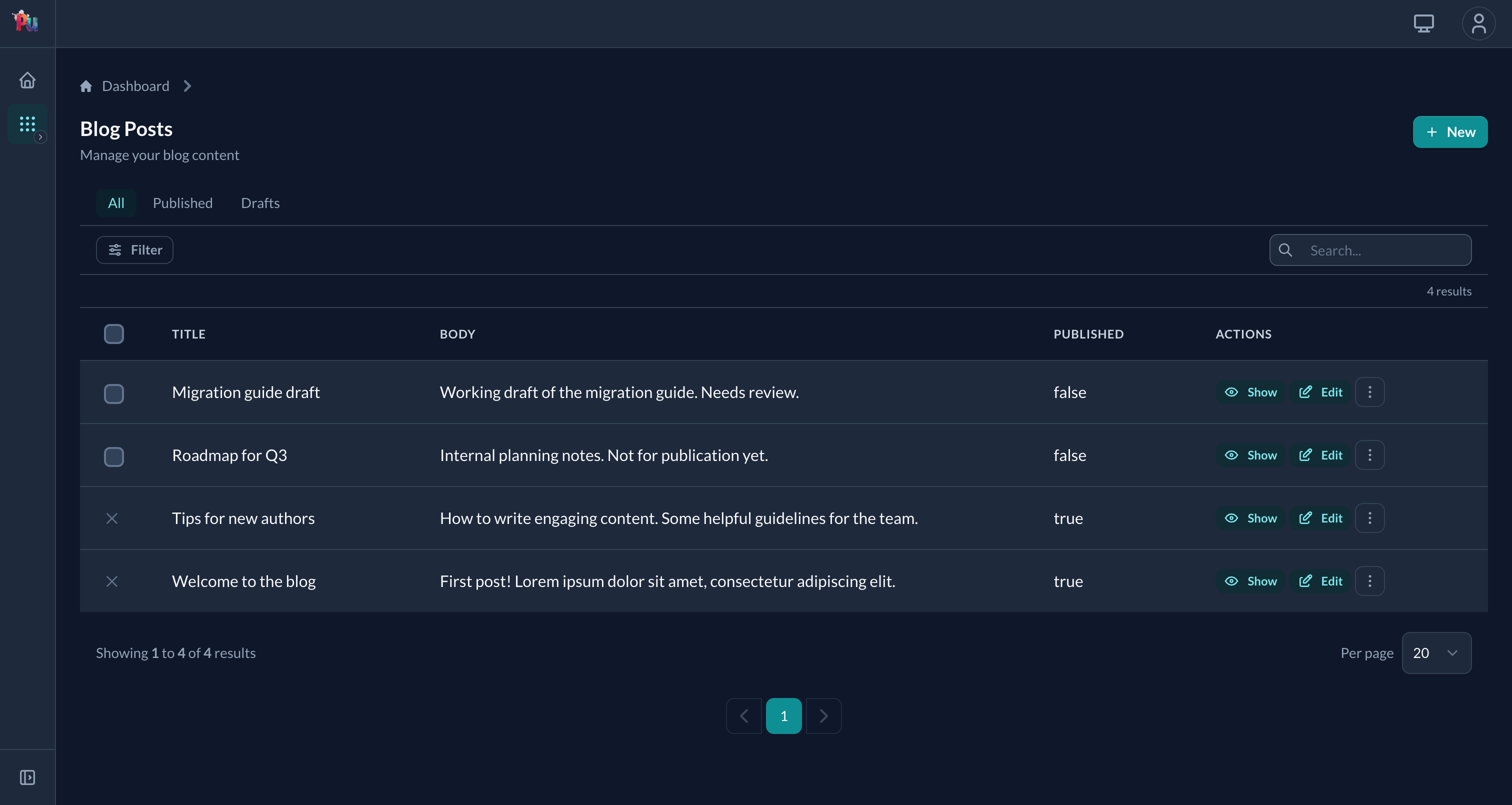
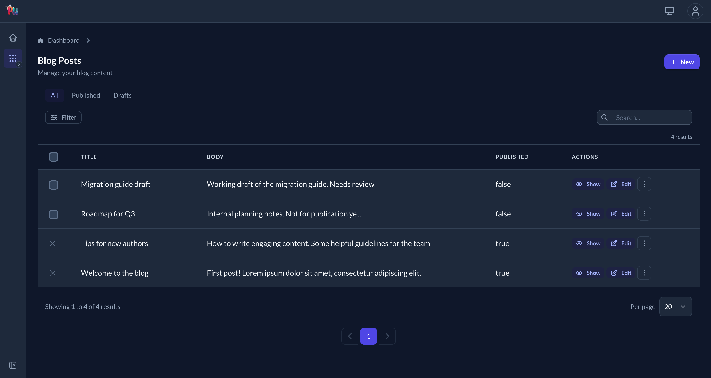
Default palette is turquoise on the left; swapping primary to indigo gives every .pu-btn-primary, focus ring, and selected-row highlight the new colour without touching any markup:
Step 3: Customize colors via Tailwind
// tailwind.config.js
theme: plutoniumTailwindConfig.merge(plutoniumTailwindConfig.theme, {
  extend: {
    colors: {
      primary:   { 50: '#eff6ff', 500: '#3b82f6', 900: '#1e3a8a' },
      secondary: { 50: '#f3f4f6', 500: '#6b7280', 900: '#111827' },
    },
  },
})
Default palette
| Color | Use |
|---|---|
primary | Brand primary (turquoise default) |
secondary | Brand secondary (navy default) |
success | Success states (green) |
info | Informational (blue) |
warning | Warning (amber) |
danger | Error (red) |
accent | Highlight (coral pink) |
Step 4: Customize design tokens (dark-mode-aware)
/* app/assets/stylesheets/application.tailwind.css */
@import "gem:plutonium/src/css/plutonium.css";
@import "tailwindcss";

:root {
  --pu-surface: #fafafa;
  --pu-border:  #d1d5db;
}

.dark {
  --pu-surface: #111827;
  --pu-border:  #374151;
}
Tokens auto-switch when the user toggles dark mode. See Reference › UI › Assets › Design tokens for the full token catalog.
Using tokens in your code
<h1 class="text-[var(--pu-text)]">Title</h1>
<p class="text-[var(--pu-text-muted)]">Description</p>

<div class="bg-[var(--pu-surface)] border border-[var(--pu-border)] rounded-[var(--pu-radius-lg)]">
  Content
</div>class MyComponent < Plutonium::UI::Component::Base
def view_template
div(
class: "bg-[var(--pu-surface)] border border-[var(--pu-border)] rounded-[var(--pu-radius-lg)]",
style: "box-shadow: var(--pu-shadow-md)"
) do
h2(class: "text-lg font-semibold text-[var(--pu-text)]") { "Title" }
p(class: "text-[var(--pu-text-muted)]") { "Description" }
end
end
endUse .pu-* component classes
Pre-styled ready-to-use components:
<%= form.submit "Save", class: "pu-btn pu-btn-md pu-btn-primary" %>| Family | Classes |
|---|---|
| Buttons | .pu-btn, .pu-btn-md/-sm/-xs, .pu-btn-primary/-secondary/-danger/-success/-warning/-info/-accent, .pu-btn-ghost/-outline, .pu-btn-soft-* |
| Inputs | .pu-input/-invalid/-valid, .pu-label/-required, .pu-hint, .pu-error, .pu-checkbox |
| Cards | .pu-card, .pu-card-body, .pu-panel-header, .pu-panel-title, .pu-panel-description |
| Tables | .pu-table-wrapper, .pu-table, -header, -header-cell, -body-row, -body-row-selected, -body-cell, .pu-selection-cell |
| Toolbars / empty states | .pu-toolbar, -text, -actions; .pu-empty-state, -icon, -title, -description |
Full catalog: Reference › UI › Assets › Component classes.
Migrating from hardcoded classes
| Old | New |
|---|---|
text-gray-900 dark:text-white | text-[var(--pu-text)] |
text-gray-500 dark:text-gray-400 | text-[var(--pu-text-muted)] |
bg-gray-50 dark:bg-gray-700 | bg-[var(--pu-surface)] |
border-gray-300 dark:border-gray-600 | border-[var(--pu-border)] |
| Long input class chain | pu-input |
| Long button class chain | pu-btn pu-btn-md pu-btn-primary |
Per-resource theming (Phlexi themes)
Override Form/Display/Table appearance per resource via a nested Theme class:
class PostDefinition < ResourceDefinition
  class Form < Form
    class Theme < Plutonium::UI::Form::Theme
      def self.theme
        super.merge(
          base:            "bg-[var(--pu-card-bg)] shadow-md rounded-lg p-6",
          fields_wrapper:  "grid grid-cols-2 gap-6",
          actions_wrapper: "flex justify-end mt-6 space-x-2",
          input:           "pu-input",
          button:          "pu-btn pu-btn-md pu-btn-primary"
        )
      end
    end
  end
end
Always super.merge(...)
Don't replace the theme wholesale — Plutonium's defaults handle invalid states, focus rings, and dark mode. super.merge keeps them.
Full theme key catalog: Reference › UI › Assets › Phlexi component themes.
Typography
Default font: Lato. Override via the layout:
class MyLayout < Plutonium::UI::Layout::ResourceLayout
  def render_fonts
    link(rel: "preconnect", href: "https://fonts.googleapis.com")
    link(href: "https://fonts.googleapis.com/css2?family=Inter&display=swap", rel: "stylesheet")
  end
end
Then configure Tailwind to use it:
theme: plutoniumTailwindConfig.merge(plutoniumTailwindConfig.theme, {
  fontFamily: {
    body: ['Inter', 'sans-serif'],
    sans: ['Inter', 'sans-serif']
  }
})
Dark mode
selector strategy. The bundled color-mode Stimulus controller handles toggling; Plutonium ships a switcher in the topbar.
Manual toggle:
document.documentElement.classList.toggle('dark')If you've overridden tokens via :root and .dark, both modes Just Work.
Per-portal chrome — eject the shell
For per-portal headers/sidebars:
rails generate pu:eject:shell --dest=admin_portalCopies _resource_header.html.erb and _resource_sidebar.html.erb into the portal's app/views/plutonium/. Edit directly.
rails generate pu:eject:layoutCopies layouts/resource.html.erb for layout-level edits.
Shell config
Plutonium.configure do |config|
  config.shell = :modern     # default — topbar + icon rail
  # config.shell = :classic  # legacy header + sidebar (only when upgrading)
end
Stimulus
// app/javascript/controllers/index.js
import { application } from "./application"
import { registerControllers } from "@radioactive-labs/plutonium"

registerControllers(application)        // ← mandatory

// Your custom controllers...
import CustomController from "./custom_controller"
application.register("custom", CustomController)
Bundled controllers: color-mode, form (pre-submit), nested-resource-form-fields, slim-select, flatpickr, easymde.
Common issues
- Stimulus controllers silently fail — if
registerControllers(application)isn't called, the entire UI's interactive layer is dead (color-mode toggle, slim-select, flatpickr, easymde, pre-submit). No error — just no behavior. plutoniumTailwindConfig.mergeis mandatory — plain spread drops defaults silently.- Tokens not switching in dark mode — you used
bg-pu-surfaceinstead ofbg-[var(--pu-surface)]. Tokens are CSS variables, not Tailwind keys. .pu-btnstyles not applying — check that Plutonium CSS is imported BEFORE Tailwind:@import "gem:plutonium/src/css/plutonium.css";then@import "tailwindcss";.
Related
- Reference › UI › Assets — full Tailwind / Stimulus / design tokens / component classes surface
- Reference › UI › Layouts — shell, eject, ResourceLayout
- Reference › UI › Forms › Theming — Form theme keys