
Components
Plutonium ships a Phlex-based component kit. Use the built-in shorthand inside pages/forms/displays, or write your own custom Phlex components by inheriting Plutonium::UI::Component::Base.
Built-in component kit
Inside any Plutonium::UI::Component::Base subclass (or any page/form/display class):
PageHeader(title: "Dashboard", description: "...", actions: [...])
Panel(class: "mt-4") { p { "Content" } }
Block { TabList(items: tabs) }
Avatar(user)
EmptyCard("No items found")
ActionButton(action, url: "/posts/new")
DynaFrameHost(src: "/some/path", loading: :lazy)
DynaFrameContent(content) { |frame| frame.render_content }
TableSearchBar()
TableScopesBar()
TableInfo(pagy)
TablePagination(pagy)
Breadcrumbs()
These are shorthand for render Plutonium::UI::PageHeader.new(...) etc. — they work because every component class is exposed as a method on Plutonium::UI::Component::Base.
Avatar
Plutonium::UI::Avatar renders a profile image for a subject. It resolves an optional image source and falls back to a deterministic avatar from the hosted Navii service, then to a generic user icon when there's nothing to show.
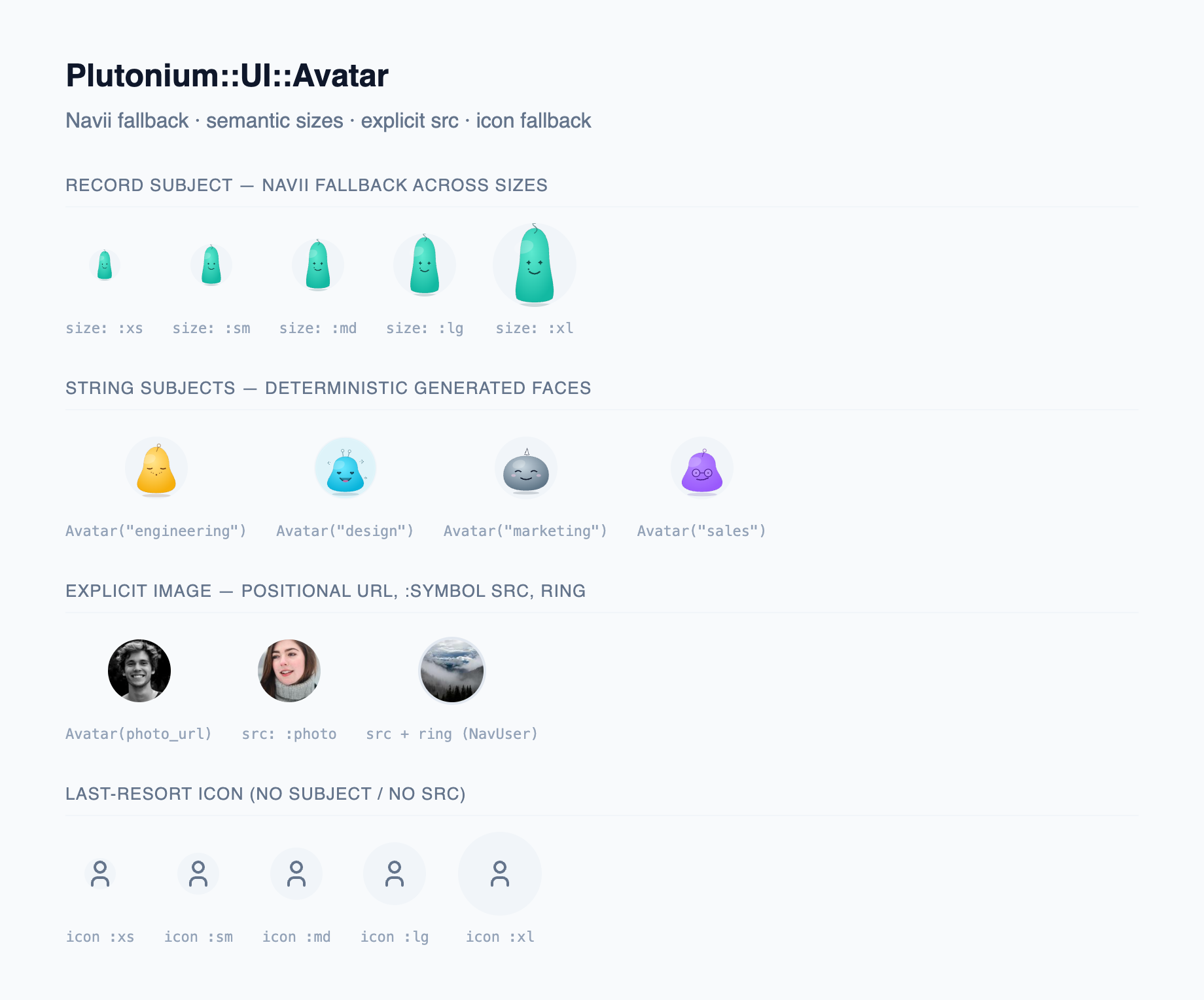
Avatar(user)                      # Navii fallback seeded from the record
Avatar(user, src: :avatar)        # user.avatar if present, else Navii fallback
Avatar(user, src: user.avatar)    # pass the attachment/uploader/URL directly
Avatar("acme-team")               # a String subject is a deterministic seed
Avatar("https://.../p.png")       # a URL-shaped subject is shown as the image
Avatar(src: "https://.../p.png") # a bare image, no subject/fallback| Param | Default | Notes |
|---|---|---|
subject | nil | Positional. The identity the fallback is seeded from: a record (hashed to a PII-free seed) or a String. Also the default alt. A URL-shaped String (http(s)://… or /…) is treated as src instead, so Avatar(photo_url) shows the image. |
src: | nil | The image. A Symbol names a method on the subject (:avatar → subject.avatar); otherwise an ActiveStorage attachment, active_shrine/Shrine uploader, or URL string. |
size: | :md | Semantic :xs 24 / :sm 32 / :md 40 / :lg 48 / :xl 64, or a raw Integer (px). |
alt: | derived | Defaults to the String subject, or the record's display name. |
class: | — | Merged over the default rounded-full classes. |
How the source resolves
src is resolved in this order, so the same component works across attachment libraries:
- ActiveStorage attachment →
helpers.url_for(the Rails-routable redirect path) - active_shrine / Shrine
UploadedFile/ CarrierWave (anything responding to#url) →value.url - URL string (
"https://…"or"/…") → used as-is
When src is absent or unattached, a Navii avatar is rendered from the subject; with no subject either, a generic user icon is shown.
Symbol src is a contract
Avatar(user, src: :avatar) calls user.avatar — the subject must respond to it (a NoMethodError is raised otherwise). Use a Symbol src only with a record subject, not a value that might be a plain string (e.g. a guest current_user).
Privacy
The value sent to Navii is always a hash of the subject's identity (Digest::SHA256 of "Class:id" for a record, or of the string for a String subject). No model names, IDs, emails, or seed strings ever reach the external service, and the avatar stays deterministic (same subject → same avatar).
Configuration
# config/initializers/plutonium.rb
Plutonium.configure do |config|
  config.navii_host_url = "https://api.navii.dev"  # default; repoint to self-host/proxy
end
The component appends Navii's /avatar/:seed route to this host.
Writing custom Phlex components
# app/components/post_card_component.rb
class PostCardComponent < Plutonium::UI::Component::Base
  def initialize(post:)
    @post = post
  end

  def view_template
    div(class: "bg-[var(--pu-card-bg)] border border-[var(--pu-card-border)] rounded-[var(--pu-radius-lg)] p-4") do
      h3(class: "font-bold text-[var(--pu-text)]") { @post.title }
      p(class: "text-[var(--pu-text-muted)] mt-2") { @post.excerpt }

      div(class: "mt-4 flex justify-between items-center") do
        span(class: "text-sm text-[var(--pu-text-subtle)]") {
          @post.published_at&.strftime("%B %d, %Y")
        }
        a(href: resource_url_for(@post), class: "text-primary-600") { "Read more" }
      end
    end
  end
end
Always inherit Plutonium::UI::Component::Base
It gives you:
- The component kit (
PageHeader,Panel,Block, …) - Resource helpers (
resource_url_for,current_user,current_record!,current_definition) - A
helpersproxy for Rails helpers (helpers.link_to,helpers.number_to_currency) - Token / class helpers (
tokens,classes)
Use in a definition
class PostDefinition < ResourceDefinition
  display :card, as: PostCardComponent       # custom display component
  input   :color, as: ColorPickerComponent   # custom input component

  display :metrics do |field|
    MetricsChartComponent.new(data: field.value)
  end
end
Use in a page / form / display
class ShowPage < ShowPage
  def render_after_content
    render RelatedPostsComponent.new(post: object)
  end
end
DynaFrameContent pattern
Enables frame-aware rendering — regular requests get the full page (header + content + footer); turbo-frame requests get only the content inside the frame.
def view_template(&block)
  DynaFrameContent(page_content(block)) do |frame|
    render_header        # skipped for frame requests
    frame.render_content # always rendered
    render_footer        # skipped for frame requests
  end
end
All pages inherit this automatically. Modals and frame navigation work without special handling.
When to call DynaFrameContent manually
Rarely. Use it when writing a custom non-resource page that needs the same frame-aware rendering as the built-in pages.
For typical custom pages, just inherit Plutonium::UI::Page::Base and override hooks like render_content — the DynaFrame wrapping happens in view_template automatically.
Conditional class helpers
For class composition in Phlex components:
class MyComponent < Plutonium::UI::Component::Base
  def initialize(active:)
    @active = active
  end

  def view_template
    div(class: tokens(
      "base-class",
      active?:   "bg-primary-500 text-white",
      inactive?: "bg-gray-200 text-gray-700"
    )) { "Content" }
  end

  private

  def active?   = @active
  def inactive? = !@active
end
classes returns the class as a kwarg-friendly hash:
div(**classes("p-4 rounded", active?: "ring-2"))
# => <div class="p-4 rounded ring-2">
tokens supports then/else branches:
tokens("base", condition?: {then: "if-true", else: "if-false"})Accessing Rails helpers
class MyComponent < Plutonium::UI::Component::Base
  def view_template
    helpers.link_to(...)
    helpers.image_tag(...)
    helpers.number_to_currency(...)
  end
end
The helpers proxy gives you everything ApplicationController#helpers exposes — including any custom helpers in app/helpers/.
Available context
Inside any custom component, the same set of helpers as pages/forms/displays — see Pages › Available context.