
Definition
Definitions configure how a resource is rendered and interacted with — which fields appear, how they render, what page chrome looks like. Auto-detection from the model handles the defaults; declare only what you're overriding.
For search/filters/scopes/sorting see Query. For custom actions see Actions.
🚨 Critical
- Don't declare for completeness. A
field :titlematching what Plutonium auto-detects is dead code. Declare ONLY when you need a different type, an option (hint:,placeholder:,wrapper:,class:), acondition:, a block, or a custom component. - Use
condition:for UI state, the policy for authorization.condition: -> { object.published? }is fine. "Only admins see this field" belongs inpermitted_attributes_for_*. - Custom action ⇒ policy method.
action :publishneedsdef publish?on the policy (see Behavior › Policy). has_centsfields use the virtual name (field :price), never:price_cents.- Nested inputs need
accepts_nested_attributes_forANDinverse_of:on the child'sbelongs_to— withoutinverse_of:, validation fails with "Parent must exist" because the parent isn't saved yet.
File location
app/definitions/post_definition.rb
packages/blogging/app/definitions/blogging/post_definition.rb| Model | Definition |
|---|---|
Post | PostDefinition |
Blogging::Post | Blogging::PostDefinition |
Hierarchy
Definitions inherit from each other so portals can override:
# app/definitions/resource_definition.rb (installed once)
class ResourceDefinition < Plutonium::Resource::Definition
  action :archive, interaction: ArchiveInteraction, color: :danger, position: 1000
end

# app/definitions/post_definition.rb (scaffolded)
class PostDefinition < ResourceDefinition
  scope :published
  input :content, as: :markdown
end

# packages/admin_portal/app/definitions/admin_portal/post_definition.rb (per-portal)
class AdminPortal::PostDefinition < ::PostDefinition
  input :internal_notes, as: :text     # admins see this; customers don't
  scope :pending_review
end
Auto-detection
Empty definition = everything auto-detected from the model:
class PostDefinition < Plutonium::Resource::Definition
end
Plutonium detects, from the model:
- Database columns (string, text, integer, boolean, datetime, etc.)
- Associations (
belongs_to,has_many,has_one) - ActiveStorage attachments (
has_one_attached,has_many_attached) - Enums
- Virtual attributes (when they have accessor methods)
| Database type | Detected as |
|---|---|
string, text | :string / :text |
integer, bigint | :integer |
float, decimal | :float / :decimal |
boolean | :boolean |
date, datetime, time | :date / :datetime / :time |
json, jsonb | :json |
Validations on the model inform the UI too: validates :title, presence: true → required field; validates :role, inclusion: { in: [...] } → select choices.
Core methods
| Method | Applies to | Use when |
|---|---|---|
field | Forms + Show + Table | Universal type override |
input | Forms only | Form-specific options |
display | Show page only | Display-specific options |
column | Table only | Table-specific options |
class PostDefinition < Plutonium::Resource::Definition
  field :content, as: :markdown                # everywhere
  input :title, hint: "Be descriptive"
  display :content, wrapper: {class: "col-span-full"}
  column :view_count, align: :end
end
Available field types
Input types (forms)
| Category | Types |
|---|---|
| Text | :string, :text, :email, :url, :tel, :password |
| Rich text | :markdown (EasyMDE editor) |
| Numeric | :number, :integer, :decimal, :range |
| Boolean | :toggle / :switch (switch — default for boolean columns), :boolean (plain checkbox) |
| Date/Time | :date, :time, :datetime |
| Selection | :select, :slim_select, :radio_buttons, :check_boxes |
| Files | :file, :uppy, :attachment |
| Associations | :association, :secure_association, :belongs_to, :has_many, :has_one |
| Special | :hidden, :color, :phone |
Display types (show / index)
:string, :text, :email, :url, :phone, :markdown, :number, :integer, :decimal, :boolean, :badge, :currency, :date, :time, :datetime, :association, :attachment, :color
Auto-inferred display formatting
These render automatically — declare an as: only to override or pass options:
| Column | Renders as | Notes |
|---|---|---|
boolean | Yes/No pill (:boolean) | green "Yes" / neutral "No"; override with true_label: / false_label: |
enum | status badge (:badge) | known statuses auto-colored; unknown values get a stable decorative color; override per-value with colors: |
has_cents decimal | currency (:currency) | delimited, 2 decimals; symbol from unit: on has_cents (model-wide) or per-display, else config.default_currency_unit / the i18n default (see below) |
display :status, as: :badge, colors: {archived: :neutral, vip: :accent}
display :price,  as: :currency, unit: "£"
display :active, as: :boolean, true_label: "Live", false_label: "Off"
Currency symbol. The unit: can be set on the model's has_cents declaration (has_cents :price_cents, unit: "£", or unit: :currency_symbol to read a method off the record for per-row currencies). That model-level unit is used everywhere the value renders as currency — the show page, tables, and grid/kanban cards. A per-display unit: overrides it for that one display; unit: false explicitly renders no symbol. When neither is set, currency falls back to Plutonium.configuration.default_currency_unit (default: the i18n number.currency.format.unit if the locale defines it — $ in en — else no symbol).
Field options
input :title,
  # Wrapper-level (label, hint, placeholder, description)
  label: "Custom Label",
  hint: "Help text",
  placeholder: "Enter value",
  description: "Shown on the show page",

  # Tag-level (HTML attributes)
  class: "custom-class",
  data: {controller: "custom"},
  required: true,
  readonly: true,
  disabled: true,

  # Layout
  wrapper: {class: "col-span-full"}
Select / choices
Static
input :category, as: :select, choices: %w[Tech Business Lifestyle]
input :status,   as: :select, choices: Post.statuses.keys
Dynamic (block required)
input :author do |f|
  f.select_tag choices: User.active.pluck(:name, :id)
end

# With context: current_user, current_parent, object, request, params all available
input :team_members do |f|
  f.select_tag choices: current_user.organization.users.pluck(:name, :id)
end

# Based on object state
input :related_posts do |f|
  choices = object.persisted? ?
    Post.where.not(id: object.id).published.pluck(:title, :id) : []
  f.select_tag choices: choices
end
Conditional rendering
display :published_at,     condition: -> { object.published? }
display :rejection_reason, condition: -> { object.rejected? }
field   :debug_info,       condition: -> { Rails.env.development? }
UI state, not authorization
condition: is for UI logic ("show this when published"). For "who can see this", use the policy's permitted_attributes_for_* — see Behavior › Policy.
Dynamic forms (pre_submit)
A field with pre_submit: true triggers a server re-render on change, re-evaluating condition: procs. Use for cascading or context-dependent forms.
class QuestionDefinition < ResourceDefinition
  # Trigger field
  input :question_type, as: :select,
    choices: %w[text choice scale],
    pre_submit: true

  # Dependents — no `as:` needed when the model column type matches
  input :max_length, condition: -> { object.question_type == "text" }
  input :choices,    condition: -> { object.question_type == "choice" }
  input :min_value,  condition: -> { object.question_type == "scale" }
end
How it works:
- User changes a
pre_submit: truefield. - Form submits via Turbo (no page reload).
- Server re-renders the form with updated
objectstate. condition:procs are re-evaluated. Newly visible fields appear; newly hidden ones disappear.
Tips:
- Only add
pre_submit:to fields that gate visibility of others. - Avoid on frequently-changed fields (every keystroke = submit).
Custom rendering
Block syntax
Display (any return value, can be a component):
display :status do |field|
  StatusBadgeComponent.new(value: field.value, class: field.dom.css_class)
end

display :metrics do |field|
  field.value.present? ?
    MetricsChartComponent.new(data: field.value) :
    EmptyStateComponent.new(message: "No metrics")
end
Input (must call form builder methods):
input :birth_date do |f|
  case object.age_category
  when 'adult' then f.date_tag(min: 18.years.ago.to_date)
  when 'minor' then f.date_tag(max: 18.years.ago.to_date)
  else f.date_tag
  end
end
phlexi_tag for declarative custom display
with: takes either a Phlex component class OR a proc whose body is rendered inside a Phlex context — HTML tag methods (span, div, a) and Tailwind classes are first-class. The proc receives (value, attrs).
# Component — preferred for anything reusable
display :status, as: :phlexi_tag, with: StatusBadgeComponent

# Inline proc — `span` here is a Phlex tag method, not a Rails helper
display :priority, as: :phlexi_tag, with: ->(value, attrs) {
  case value
  when 'high'   then span(class: "badge badge-danger")  { "High" }
  when 'medium' then span(class: "badge badge-warning") { "Medium" }
  else span(class: "badge badge-info") { "Low" }
  end
}
See UI › Components for writing reusable Phlex components.
Custom component class
input   :color_picker, as: ColorPickerComponent
display :chart,        as: ChartComponent
Column options
column :title,  align: :start    # default
column :status, align: :center
column :amount, align: :end
Value formatting
formatter: receives just the value. Use a block when you need the full record.
column :description, formatter: ->(value) { value&.truncate(30) }
column :price,       formatter: ->(value) { "$%.2f" % value if value }
column :status,      formatter: ->(value) { value&.humanize&.upcase }

# Block — full record access
column :full_name do |record|
  "#{record.first_name} #{record.last_name}"
end
Nested inputs
Inline forms for associated records. Requires accepts_nested_attributes_for on the model.
class Post < ResourceRecord
  has_many :comments
  has_one  :metadata

  accepts_nested_attributes_for :comments, allow_destroy: true, limit: 10
  accepts_nested_attributes_for :metadata, update_only: true
end

class PostDefinition < ResourceDefinition
  nested_input :comments do |n|
    n.input :body, as: :text
    n.input :author_name
  end

  # Or use another definition
  nested_input :metadata, using: PostMetadataDefinition, fields: %i[seo_title seo_description]
end
Options
| Option | Description |
|---|---|
limit | Max records (auto-detected from model; default 10) |
allow_destroy | Show delete checkbox (auto-detected) |
update_only | Hide "Add" button — only edit existing |
description | Help text above the section |
condition | Proc to show/hide |
using | Another Definition class |
fields | Subset of fields from the referenced definition |
Gotchas
inverse_of:is required on the child'sbelongs_to:rubyclass Comment < ResourceRecord belongs_to :post, inverse_of: :comments # ← without this, validation fails with "Parent must exist" end- Don't put
*_attributeshashes in the policy. Plutonium extracts nested params from the form definition, not the policy. The policy permits just the association name (:variants);nested_input :variantshandles the rest. Adding{variants_attributes: [...]}topermitted_attributes_for_createrenders as a literal text input. See Behavior › Policy. update_only: truehides the Add button — forhas_oneand "settings"-style associations.- Custom class names — use
class_name:in the model ANDusing:in the definition.
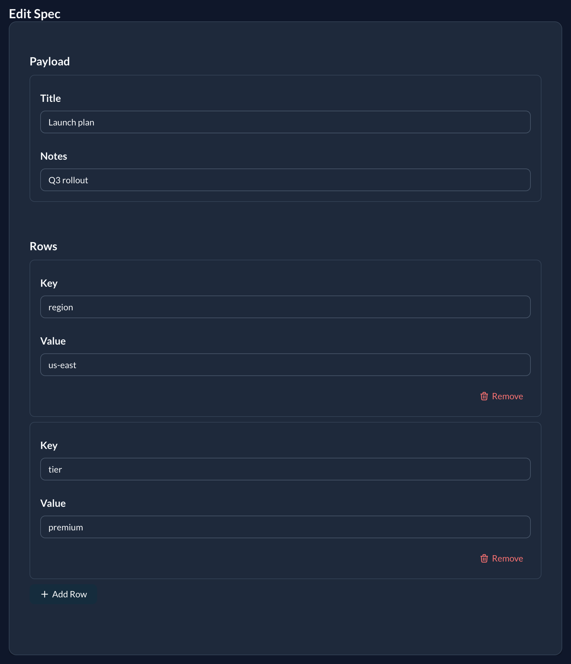
Structured inputs
Classless inline fieldsets backed by a JSON/jsonb column. No model associations required — the whole sub-form is serialised into a single column as a hash (single form) or an array of hashes (repeater).
# model
class Listing < ApplicationRecord
  include Plutonium::Resource::Record
  # columns: address (json), contacts (json)
end

# definition
class ListingDefinition < ResourceDefinition
  # single → stored as a hash
  structured_input :address do |f|
    f.input :street
    f.input :city
  end

  # repeater → stored as an array of hashes (max 5 rows)
  structured_input :contacts, repeat: 5 do |f|
    f.input :label
    f.input :phone_number
  end
end
Options
| Option | Description |
|---|---|
repeat: | true (default cap of 10) or an integer max-rows cap. Omit for a single-hash form. |
using: | Another Definition class whose input declarations are used as the fieldset. |
fields: | Subset of fields to take from the using: definition. |
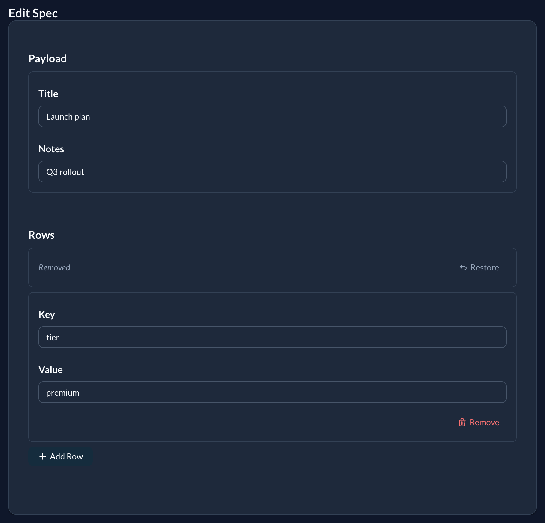
Removing rows
Each repeater row has a Remove button. Removing a row collapses it to a compact Removed — Restore bar and disables its inputs, so the browser omits them from the submission. The server simply rebuilds the JSON column from the rows it receives — there is no _destroy marker. Restore brings the row back before saving.
Policy
Permit the column name as a plain symbol — Plutonium handles the nested hash params automatically:
def permitted_attributes_for_create
  super + %i[address contacts]
end
On interactions
structured_input is also available on Plutonium::Interaction::Base. The attribute is declared automatically; execute receives the value as a Hash (single) or Array<Hash> (repeater). nested_input and accepts_nested_attributes_for are not available on interactions.
Validation
Structured inputs are not validated for you
The fields are classless render declarations, so there is nothing for Plutonium to attach validations to (unlike nested_input, whose nested records run their own model validations). Whatever the form submits is stored as-is, after blank rows are dropped — no per-field server-side validation.
Specifically:
- HTML constraints are client-side only. A field's
required:and a select'schoices:guide the browser but are not enforced on the server — an API call or a crafted request can submit anything. - Selects silently drop unknown values. If a stored value is not among a
as: :selectfield'schoices:, the<select>renders blank, and saving the form overwrites the stored value withnil(the option list is the only thing constraining it). This is standard<select>behaviour, but it bites harder here because JSON values aren't constrained by a DB enum and yourchoices:can drift. Keepchoices:a stable superset, or use a free-text input, when values can change over time.
To enforce anything, add the validation yourself — it runs server-side:
# resource: validate the JSON column on the model
class Listing < ApplicationRecord
  include Plutonium::Resource::Record

  validate :contacts_have_labels
  def contacts_have_labels
    Array(contacts).each_with_index do |row, i|
      errors.add(:contacts, "row #{i + 1} needs a label") if row["label"].blank?
    end
  end
end

# interaction: it's an ActiveModel, validated before `execute`
validate do
  contacts.each { |c| errors.add(:contacts, "label required") if c[:label].blank? }
end
Form layout
Declare a declarative layout for forms without changing per-field configuration. Sections are evaluated against the policy-filtered field list at render time, so a field filtered out by the policy is simply skipped.
class PostDefinition < ResourceDefinition
  form_layout do
    section :identity, :title, :slug,
      label: "Post identity", description: "Visible URL and title"

    section :content, :body, :excerpt,
      collapsible: true, columns: 1

    section :publishing, :published_at, :category,
      collapsible: true, collapsed: true,
      condition: -> { current_user.publisher? }

    ungrouped label: "Other details"
  end
end
form_layout block
The block is evaluated once and stored on the class. Re-declaring form_layout in a subclass replaces the parent layout as a unit; per-field input config inherits normally.
With no form_layout declared the form renders unchanged as a single responsive grid — fully backwards-compatible.
section(key, *fields, **opts)
Groups a set of fields under an optional heading.
| Argument | Description |
|---|---|
key | Symbol. :ungrouped is reserved — use the ungrouped macro instead (raises ArgumentError otherwise). |
*fields | Ordered field keys to place in this section. |
label: | Section heading. Defaults to key.to_s.humanize (e.g. :shipping_address → "Shipping address"). |
description: | Optional help line rendered below the heading. |
collapsible: | Boolean (default false). Wraps the section in a native <details>/<summary> (no JS). |
collapsed: | Boolean (default false). Initial collapsed state when collapsible: true. |
columns: | Positive Integer. Overrides the section grid column count (e.g. columns: 2). Omit to use the form's default responsive grid. Must be a positive Integer — any other value raises. (Literal only — not dynamic.) |
condition: | Lambda evaluated in the form instance context — same semantics as input ..., condition:. object, current_user, helpers etc. are all available. A falsey result hides the entire section and withholds its fields (they do not spill into ungrouped). |
Every option except columns: may be either a literal or a proc resolved at render time in the same form instance context as condition: (so object, current_user, params, helpers are all available). This makes the layout record-aware — e.g. collapse a section by default only for existing records:
section :advanced, :seo_title, :notes,
  collapsible: true,
  collapsed: -> { object.persisted? },          # open for new, collapsed for edits
  label: -> { object.new_record? ? "Set up" : "Advanced" }
A section that resolves to zero fields — every declared field filtered out by the permitted set, or no field assigned — renders nothing at all (no heading, no grid). This keeps forms clean when fewer attributes are permitted than declared (notably + New, where the create policy often permits a subset). The check is purely "are there fields to render"; it does not evaluate per-field condition: procs (those run later, at field render). So if you want a whole section to appear only under some state, gate it with the section's own condition: rather than relying on every field inside it being hidden:
section :shipping, :address, :city, :postcode,
  condition: -> { object.requires_shipping? }   # hide the section as a unit
ungrouped(**opts)
A macro (not a section call) that configures the implicit bucket collecting every permitted field not claimed by any section. Takes no field list — its fields are computed at render time.
- Accepts the same options as
section:label:,description:,collapsible:,collapsed:,columns:,condition:. - Position — where you call
ungroupedin the block is where leftovers appear. Omit it entirely and leftovers render last, after every declared section, with no heading. (Declaringungroupedat the very end is therefore equivalent to omitting it, except that the explicit form lets you add alabel:and other options.) - Declaring
ungroupedmore than once in a singleform_layoutraisesArgumentError.
form_layout do
  section :advanced, :seo_title, :seo_description, collapsible: true
  ungrouped label: "Core fields"   # leftovers rendered here, with a heading
end

# To float leftovers ABOVE your sections, declare `ungrouped` first:
form_layout do
  ungrouped label: "Core fields"
  section :advanced, :seo_title, :seo_description, collapsible: true
end
Layout references keys; config stays on input
form_layout and section carry section-level options only. All per-field rendering config — as:, the field's own label:, choices:, per-field condition:, pre_submit:, blocks — remains on the input declaration. Layout never duplicates field config.
This includes a field's column span. In a section with columns:, fields flow into single grid cells by default; a field that declares its own span via wrapper: {class: "col-span-..."} keeps it — a field-level span always wins, so you can opt one field back to full width inside a multi-column section:
input :notes, wrapper: {class: "col-span-full"}   # spans the whole row...

form_layout do
  section :details, :first_name, :last_name, :notes, columns: 2  # ...even here
endclass ArticleDefinition < ResourceDefinition
# per-field config on input — untouched by form_layout
input :body, as: :markdown
input :published_at, hint: "Leave blank to save as draft"
input :visibility, as: :select, choices: %w[public private unlisted]
form_layout do
section :writing, :title, :body, :excerpt, label: "Content"
section :meta, :published_at, :visibility, :tags, label: "Publishing settings"
end
endFields not in the permitted set are skipped
A section only renders the fields that are actually in the form's permitted set for the current request. A key it lists that isn't there — a typo, or a field excluded by policy, per-action permitted_attributes, entity scoping, or nesting — is silently dropped, never an error. This lets a single form_layout reference conditionally-permitted fields without crashing the form in the contexts where they're filtered out. And when every field a section lists is dropped this way, the section's chrome is dropped with it (see the zero-fields note above) — so the same layout can serve a richly-permitted edit and a minimal new without leaving empty headings behind.
On interactions
form_layout is also available on Plutonium::Interaction::Base. The same DSL groups the interaction's attribute declarations into sections. Interaction forms (Plutonium::UI::Form::Interaction) pick up the layout automatically — no extra wiring needed.
Dynamic options and condition: work here too, with one difference: in an interaction form object is the interaction instance (not a record). For a record action, the record is object.resource — so e.g. collapsed: -> { object.resource.archived? }.
class PublishPostInteraction < Plutonium::Interaction::Base
  attribute :publish_at, :datetime
  attribute :notify_subscribers, :boolean, default: false
  attribute :notify_message, :string

  form_layout do
    section :timing, :publish_at, label: "When to publish"
    section :notifications, :notify_subscribers, :notify_message,
      label: "Subscriber notifications",
      collapsible: true,
      condition: -> { object.has_subscribers? }
  end
end
File uploads
input :avatar, as: :file
input :avatar, as: :uppy

input :documents, as: :file, multiple: true
input :documents, as: :uppy,
  allowed_file_types: %w[.pdf .doc],
  max_file_size: 5.megabytes
Context in blocks
Inside condition: procs and block-form input/display:
object— the record being edited or displayedcurrent_usercurrent_parent— parent record for nested resourcesrequest,params- All view helpers (via the same context as controllers)
Runtime customization hooks
Override these methods for dynamic per-request configuration:
class PostDefinition < ResourceDefinition
  def customize_fields    # add/modify fields
  def customize_inputs
  def customize_displays
  def customize_columns
  def customize_filters
  def customize_scopes
  def customize_sorts
  def customize_actions
end
Useful when configuration depends on current_user, the environment, or feature flags.
Page configuration
Titles and descriptions
class PostDefinition < ResourceDefinition
  index_page_title       "All Posts"
  index_page_description "Manage your blog posts"

  new_page_title         "Create Post"
  show_page_title        -> { current_record!.title }    # dynamic
  edit_page_title        -> { "Edit: #{current_record!.title}" }
end
Breadcrumbs
breadcrumbs              true     # global default
index_page_breadcrumbs   false    # per-page override
show_page_breadcrumbs    true
new_page_breadcrumbs     true
edit_page_breadcrumbs    true
interactive_action_page_breadcrumbs true
Form configuration
class PostDefinition < ResourceDefinition
  # "Save and add another" / "Update and continue editing"
  #   nil   (default) — auto: hidden for singular resources, shown for plural
  #   true            — always show
  #   false           — always hide
  submit_and_continue false

  # How :new / :edit and interactive actions render
  #   :slideover   (default) — slide-in panel from the right
  #   :centered              — centered dialog
  #   false                  — full standalone pages (no modal)
  # size: optional, one of :sm, :md (default), :lg, :xl, :auto, :full
  modal :centered, size: :lg
end
modal: is the default for framework :new/:edit and every interactive action on this definition. Per-action modal: / size: overrides win — see Actions.
show_in
class PostDefinition < ResourceDefinition
  show_in :modal   # open the show page in a centered modal from table & grid links
  # show_in :page  # (default) full-page navigation to the show route
end
Controls how the show page opens when a record is clicked in the table or grid (and serves as the default for a kanban board, which can override it per-board):
:page(default) — full-page navigation to the show route.:modal— the show page opens in a centered dialog. This is deliberately independent ofmodal:/modal_modeabove (which styles:new/:edit) — show is always centered, never a slideover. From inside the modal an expand icon opens the full page in a new tab; ⌘/Ctrl-click (or middle-click) on the row/card does the same directly.
An unknown mode raises ArgumentError.
Metadata panel (show page)
A right-side aside on the show page rendering label/value rows. Keeps the main card focused on substance; chrome (timestamps, ownership, system flags) lives in the aside.
class PostDefinition < ResourceDefinition
  metadata :author, :state, :created_at, :updated_at
end
Behavior:
- Opt-in. No
metadatacall → show page renders full-width. - Policy-aware. Fields intersect with the policy's permitted attributes. The panel auto-hides when nothing is permitted.
- Deduplicated. Fields listed in
metadataare removed from the main card so values aren't shown twice. - Responsive. Side-by-side at
lg+, stacked below. - Formatting inherits. Field labels and
as:declarations propagate — the metadata panel uses the same field-rendering machinery as the main card.
Index views (Table & Grid)
Resources can offer both Table and Grid views. The user switches via the toolbar; the choice persists per-resource via cookie.
class UserDefinition < ResourceDefinition
  # No `index_views :table, :grid` needed — declaring grid_fields auto-enables :grid.
  grid_fields(
    image:     :avatar,           # ActiveStorage attachment, Shrine, or URL
    header:    :name,             # falls back to to_label
    subheader: :email,
    body:      :bio,
    meta:      [:role, :status],  # rendered as small pills
    footer:    :last_seen_at      # falls back to :created_at
  )

  default_index_view :grid        # optional — initial view when no cookie
  grid_layout :media              # :compact (default) or :media
  grid_columns 3                  # pin lg+ cols; default is 1/2/3/4 responsive
end| Method | Purpose |
|---|---|
index_views :table, :grid | Which views are available. Default [:table]. Usually unnecessary. |
default_index_view :grid | Initial view when no cookie. Falls back to first available view. |
grid_fields(...) | Map card slots to fields. Implicitly enables :grid. |
grid_layout :compact | :media | :compact puts image left of content; :media stacks image full-width on top. |
grid_columns N | Override responsive column count on lg+. Default is 1/2/3/4 at sm/md/lg/xl. |
Grid slots — :image, :header, :subheader, :body, :meta, :footer — are all optional. :meta accepts an array; the rest are single fields. Slots pointing at policy-blocked fields collapse silently.
Only declare index_views explicitly to disable one (e.g. index_views :grid to drop the table view).
Custom page classes
Override the rendered page entirely — full control via Phlex:
class PostDefinition < ResourceDefinition
  class IndexPage < IndexPage      # inherits the parent's nested class
    def view_template(&block)
      div(class: "custom-header") { h1 { "Custom" } }
      super(&block)
    end
  end

  class Form < Form
    def form_template
      div(class: "grid grid-cols-2") do
        render field(:title).input_tag
        render field(:content).easymde_tag
      end
      render_actions
    end
  end
end
See UI › Pages and UI › Forms for the full page-class surface.
Related
- Query — search, filters, scopes, sorting
- Actions — custom + bulk actions
- Behavior › Policy —
permitted_attributes_for_*, authorization - UI › Forms — field builder, association inputs, theming
- UI › Pages — custom page classes